Netball Players Association
Building a visual identity that reflects an established and recognised representative body.
The Netball Players Association (NPA) represents and supports netball players across all levels, advocating for their welfare and providing a trusted voice within the sport. As the organisation grew, they recognised the need for a refreshed visual identity that reflected their role as an established and trustworthy representative body. The goal was to move away from a youthful, sporty aesthetic towards a more traditional and credible brand presence, one that communicates “we are here for the players.”

Slate Blue
PMS: 2159 C
CMYK: 77, 44, 24, 2
RGB: 69, 123, 157
HEX: #457B9D
Mint Cream
CMYK: 4, 0, 7, 0
RGB: 242, 248, 238
HEX: #F1FAEE
Dark Navy
PMS: 534 C
CMYK: 96, 89, 40, 33
RGB: 28, 53, 87
HEX: #1D3557
Powder Blue
PMS: 628 C
CMYK: 32, 1, 13, 0
RGB: 170, 218, 220
HEX: #A8DADC
Deep Crimson
PMS: 1805 C
CMYK: 22, 99, 83, 13
RGB: 175, 35, 52
HEX: #AF2233
Imperial Red
PMS: 2034 C
CMYK: 4, 93, 73, 0
RGB: 230, 57, 71
HEX: #E63946
Rubik
Rubik is a modern sans-serif typeface with a slightly rounded, geometric design that balances readability with a distinctive, contemporary aesthetic. Originally designed by Hubert and Fischer for Google’s Chrome Cube Lab, Rubik features a clean, friendly appearance with subtle curves that soften its structured letterforms. Its versatile weight range makes it suitable for both digital and print applications, ensuring clarity in headlines, body text, and branding materials. The typeface conveys a sense of approachability and innovation, making it an excellent choice for brands looking to project a modern yet welcoming identity.
Display & Headings - Rubik Bold
Aa Bb Cc Dd Ee Ff Gg Hh Ii Jj Kk Ll Mm Nn Oo Pp Qq Rr Ss Tt Uu Vv Ww Xx Yy Zz
1 2 3 4 5 6 7 8 9
! " $ % & * ( ) @ ? > < | : ; ' , .
Sub-Headings - Rubik Medium
Aa Bb Cc Dd Ee Ff Gg Hh Ii Jj Kk Ll Mm Nn Oo Pp Qq Rr Ss Tt Uu Vv Ww Xx Yy Zz
1 2 3 4 5 6 7 8 9
! " $ % & * ( ) @ ? > < | : ; ' , .
Body Copy - Rubik Light
Aa Bb Cc Dd Ee Ff Gg Hh Ii Jj Kk Ll Mm Nn Oo Pp Qq Rr Ss Tt Uu Vv Ww Xx Yy Zz
1 2 3 4 5 6 7 8 9
! " $ % & * ( ) @ ? > < | : ; ' , .


The rebrand introduced a fresh logo, modernised typeface, and a new colour scheme designed to convey stability, trust, and professionalism. The updated identity features a bold yet balanced colour palette of deep blues, soft neutrals, and warm accent tones. This combination offers a modern yet traditional feel, helping to position NPA as a credible and established organisation. The Rubik typeface was chosen for its geometric yet approachable character, providing clarity and flexibility across digital and print applications.


The refreshed identity has given the NPA a more authoritative and professional presence, supporting its mission to represent players with integrity. The new look has improved consistency across channels, strengthened brand recognition, and reinforced the organisation’s position within the netball community, maintaining a modern and approachable aesthetic.

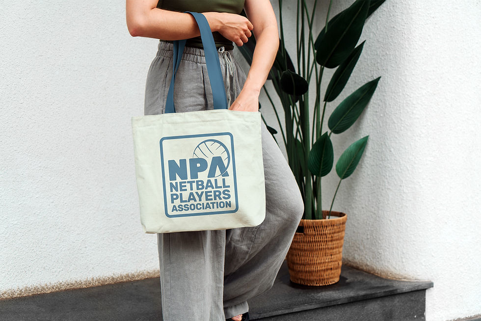


The NPA brand refresh successfully shifted the organisation’s visual language from sporty and energetic to established and trustworthy. By introducing a traditional yet contemporary design system, the new identity reflects the organisation’s evolving role and creates a solid foundation for future growth and advocacy.